Om Kins visuella språk
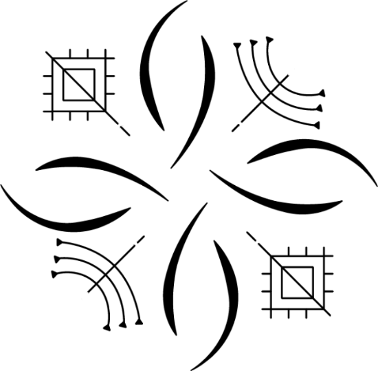
The visual language of Kin Museum of Contemporary Art has emerged from a decorative language that is much older than even the city of Kiruna. With letters, symbols and time markers from the Sami culture, a unique and enchanting graphic world has been created. It is a world of shifting, but recurring elements of time and symbolism that create a framework of both meaning and depth for Kin’s communication.
Symbols of luck and prosperity are woven together with markers of the changing passage of time in the arctic cycle. This visual language is the result of a collaboration between the Sami artists Inga-Wiktoria Påve and Fredrik Prost and the designers Johanna Lewengard and Benedetta Crippa.
The new house typeface, GT Sectra, balances high readability and richness of detail. From a distance it works as a rather low-key serif, but up close we get to experience the strong character of the letters, designed as if they were roughly carved out of wood or ice, or cut out with scissors from paper. The fact that Kin’s signage, printed matter and website are now produced in four different languages, including Northern Sami, requires a typeface with corresponding language support. GT Sectra is a rare example in Europe, as the type foundry Grilli Type writes in black and white that the font supports, amongst others, Northern Sami. Without their acknowledgement of Indigenous and minority languages, we would have had to rely on typefaces that share some diacritics with Northern Sami. That GT Sectra has such a wide language support is the result of a collaboration between no less than six different type designers.
The choice of the green color begins with Kin’s spatial reality. The museum is located in the middle of Kiruna’s town hall, in Henning Larsen's alternately cylindrical and cubic architecture in gold, black and white with many black, closed doors. The color meets the visitor already at Luca Frei’s sculpture in the entrance, to continue guiding the visitor through Kin’s different spaces, inside and outside the building.
What is usually referred to as a logotype is produced under the working name of “recurring image at work”. A linguistic shift that directs attention to what it does rather than is and represents. “A synopsis,” says Inga-Wiktoria during a meeting, a reminder of how Kin's visual language constitutes a whole story.
